Simulating Covid-19: Part 1
To understand the effects that more testing could have on the course of the pandemic, I constructed a simple model that I could use to simulate and visualize the effects of different policies. This post, the first in a series, introduces the model. In a follow-up post, I’ll use the model to compare the effects of a policy of nonspecific or uniform social distancing with those from a targeted policy that uses tests to make sure that someone who is infectious is more likely to be quarantined.
This is not the type of model one can use to capture the actual course of the disease. For that purpose, only a fully fledged model of the type developed by epidemiologists will suffice. Instead, it is a toy model that allows a visualization that helps explain how the more complicated models work. That said, it also has enough structure to offer some insight into two relevant questions that we should be asking:
-
How much difference does it make to the outcome if the test used to decide who gets isolated has a higher false negative rate. Answer? Very little.
-
If we contrast a nonspecific policy of social distance with a targeted policy guided by frequent testing that is equally effective at containing the virus, how much more disruptive is the nonspecific policy? Answer? Way more disruptive.
The model can be represented by the three types of symbols that move around in a box:
- Blue inverted triangles, which are vulnerable to catching the virus.
- Red circles, which are infectious.
- Purple squares, which were infectious before but have recovered and now can neither catch nor transmit the virus.
Here are the main rules behind the simulation:
- The symbols move around at random.
- The probability that a vulnerable triangle is infected by a red circle goes up when they get sufficiently close.
- After a random period of time, a red dot recovers and turns into a purple triangle.
- To simplify the dynamics, I assume that all red dots recover and that none of them die.
Adding a realistic death rate – something on the order of 1% of the red dots – will have little effect on the dynamics of the model. When it comes time to assess different policies, it will be enough to know that deaths will be proportional to the cumulative number of people who are infected.
Visualizing One Run of the Model
The run of the model illustrated here has 200 symbols, 5 of which are selected at random and assumed to be infectious.
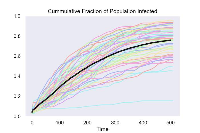
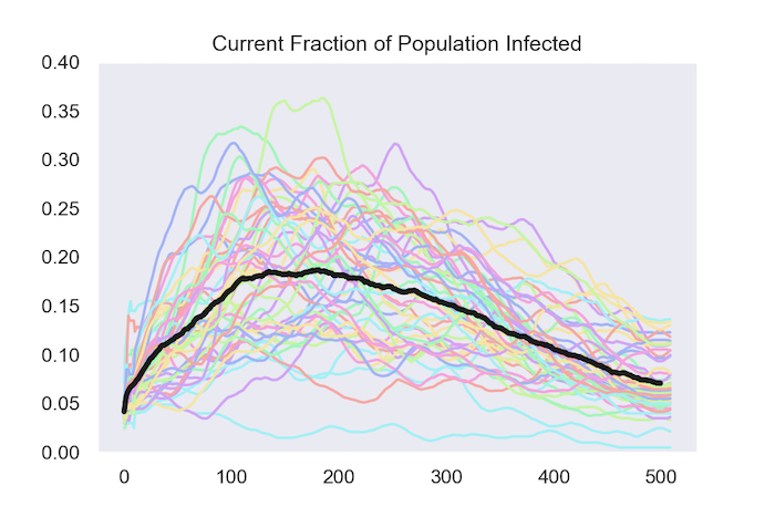
Summary Data from 50 Runs of the Model
One way to summarize a run of model is to track the cumulative fraction of the population that has been infected by the virus. The first figure shows how this evolves in 50 runs of the model. The black line is the average at each date over these 50 runs.
The other way to track what happens is by following the fraction of the population that is infected at each date. The next figure does this for the same 50 runs and once again shows the average in black.
So far, all the model does is replicate a few of the basic features of more realistic models that epidemiologists work with. The more interesting part comes in Part 2, where I use the model to answer the two questions highlighted in the beginning:
- How much disruption can testing avoid?
- How much does it matter if the tests are inaccurate?